“There are no sentimental items, only sentimental people.” — The Minimalists
In praise of the essential
I believe typography—the main focus of my work as a designer—is one of the best examples of how signs can convey a wide range of meanings, provided the signs themselves are kept as simple as possible.
Michelangelo once said that sculpture emerges by removing material. I believe the same is true for typography. The more you subtract—the more you strip the flesh from the signs—the more meaning you can express.
I give empty space a communicative purpose, based on its relationship with full space. Space itself plays a fundamental role in typography.
Empty space does not imply a lack of information. On the contrary, it is an expressive element—as important as full space, and sometimes even more so. For example, it can represent a pause, an interruption, or a moment to reflect.
Text plays a fundamental role within space, independent of its purpose as something to be read. Text fills empty space. It is the counterpart to emptiness—a balance between presence and absence.
Typography is rich in expressive potential. It offers designers endless possibilities, and that still surprises me. It can be strong, subtle, dynamic—a world full of expression.
If typography is black on white—the white of the paper and the black of the ink—then the relationship between these two colours reveals its essence: to communicate in the most essential way.
I haven’t designed many works in colour. I only use it when it serves the message. After all, don’t you think black and white are the colours of imagination? The colours of a world built from ideal images?
This synthesis—black and white—is not a representation of something else. It is not a simulation of what doesn’t exist, but rather a new and unexpected reality.
Colours can never fully reproduce reality. Black and white, on the other hand, suggest the edges of perception. In the beginning, lightness. In the end, darkness. It is the synthesis of communication—and the synthesis of life.
White and black. Outside and inside. Within and beyond. Private and public. Full and empty. Noise and silence. Pause and continuity. Rhythm and arrhythmia.
Black and white are an attitude of reduction—pushed to the limit.
Less is more.
Words by AG Fronzoni
00: A deeper simplicity
Minimalism Life’s premium edition continues to peel back the layers of minimalism—not just as an aesthetic, but as a lens for living and creating. Through original essays, thoughtful reflections, and in-depth case studies, we explore where minimalism meets creativity, culture, consumerism, and intentional growth.
Not yet subscribed? Join us for $5/month or $50/year to unlock every essay—including our latest. The next one lands on 9 April and dives into relentless simplicity—a look at how cutting through complexity can sharpen clarity.
01: Journal
Read entries from the archive of the Minimalism Life® community journal
Living lean: subtracting the ‘fat’ in our lives
Words by Carl Phillips
Embracing freedom: the art of letting go through minimalism
Words by Nate Grant
The power of play: how play is a powerful antidote to mental clutter
Words by Jayashree Chenglath
Share your story
Do you have an interesting story you would like to share on minimalism.com? We want to read about it. You have the opportunity write about your experience of how minimalism has impacted your life and get your words published in our community journal.
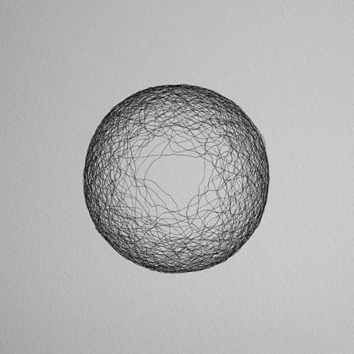
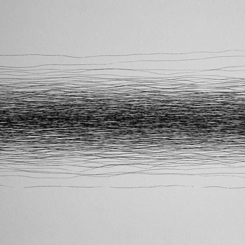
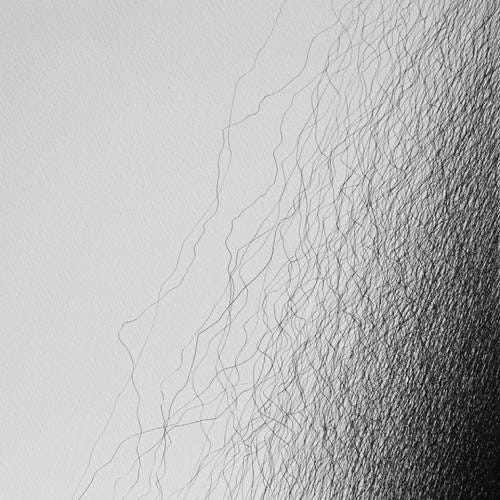
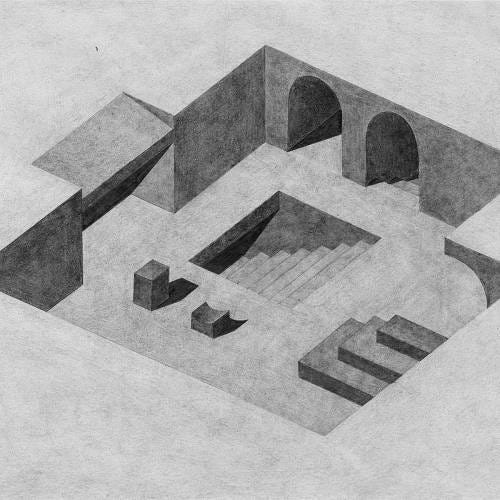
02: Minimal art
From our curated gallery
03: Minimal design
Explore our list of curated design resources
CycleMarks (tool/software)
Kia instrument (synth) (tool/software)
04: Minimal lifestyle
Explore our list of curated lifestyle resources for simple living
Lumenate (tool/experiment)
The story of stuff (video)
Stuffocation – Living more with less by James Wallman (book)
05: Shop
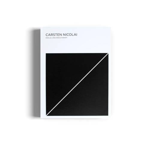
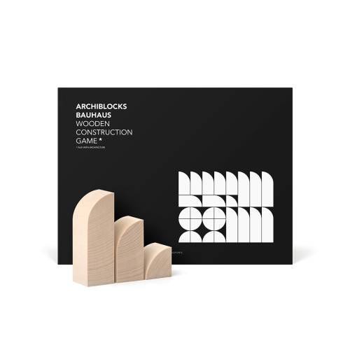
Discover our hand-picked minimalist products in the Minimalism Life® shop

06: Brands anchored by simplicity and sustainability
Minimalism can mean frugality and owning less, but it can also mean supporting ethical brands with sustainability at their core. Here are a few you might find interesting—just remember, clothes are not an investment.
CLAE: Minimalist footwear from LA
Stiksen: Premium caps from Sweden
Collars&Co: Minimalist polo shirts
JAK: Portuguese leather sneakers
Nordic Knots: Rugs inspired by the beauty of the Nordic light
The Resort Co: Eco-conscious and artisan vacation wear
Steele & Borough: Vegan, lightweight and water repellant bags
Escuyer: Accessories designed in Brussels
Void Watches: Simple Swedish timepieces
Meller: Minimal shades
Wahts: Minimal monochromatic menswear
Floyd: Unique and distinctive travel cases
Mismo: Bags and accessories from natural materials
Discover more minimal brands on minimalism.com


This reads like poetry. Fronzoni’s reverence for space, simplicity, and the quiet power of contrast is a reminder that design—like language—is often most profound in its restraint. As someone who writes about psychology and compassion, I can’t help but see the parallel: emptiness doesn’t mean absence; it’s what makes meaning possible.
Black and white are not limits—they’re invitations to imagine more deeply.
Here’s to making the world A Little Bit Kinder. ⚫⚪💛